Since we are allowed to upload previous years' works, here's the designs I've done for my class tee-shirt last year:)
The original design I proposed for the back was actually just a collection of simple small people holding on to an object, each representing one of our classmates with the thing she likes (e.g. Pam likes to play cello, so it's a little person with a cello). However, after much discussion, almost all my classmates wanted to make the tee-shirt personalised, so that everyone has only the person representing themselves on their back.
As the initial design had been quite simple, I thought that it would just take me around 2 to 3 days to complete it. However, now that the idea had changed, each design had to look more complete and complicate and must be able to fill the back of a tee-shirt without making it look too empty. Furthermore, since it was a personalised class-tee, all the designs must be similar in terms of the complexity, the way of drawing and the design of the person, so as to maintain a consistency throughout, so I had to put in a lot of thoughts in the designs
And since my monitress wanted the whole thing to be done by CSM which was somewhere in April, I had around 2 months to finish 35 individual A6(14.8 x 10.5cm) sized drawings after collating the designs each of my classmates wanted (this took a super long time, some of them only told me a few days before the submission. I tried to give them as much time so as to make everyone happy:). That period was really quite stressful, but I didn't regret taking on the challenge, and I was happy doing so much drawing:)
Anyway. While drawing, I realised that I didn't want the design to look boring, so instead of simply holding on to the objects, I integrated almost all the objects into the person, though some was easier than the other, the end results were much more interesting, and I always liked my work to have little 'surprises' .For example, for Gab's iPod, the song was Sherlock by Shinee(her favourite<3, she loved it!), total:3.30 mins(our class population), played: 3.08 mins(our class lol), but sadly this couldn't be printed on the shirt since it was too small. In the end, my friends were quite pleasantly surprised and happy about how each of the little persons turned out.
Though I was not really that happy with how the designs turned out to be. Firstly was of course due to the fact that we cannot print personalised shirts as it will be too expensive, and we only found out about this when the designs were done, so many of the details I worked on simply could not be depicted on the shirt. Secondly was the choice of colour, I had wanted more contrast between the background and the words but this was the colours chosen by my class(it was the better one out of the two the vendor provided), I still feel it's kind of silly putting blue on blue though....Lastly was the lines, if I had more time, I would definitely worked more on the thickness of the lines, probably have more lines with varying thickness. However, these thin lines probably worked better for this shirt since inconsistent thickness might make it look a bit messy?
I also felt really different from how it was when I designed for my CCA tee-shirt last year, as that design was very much finalised when I submitted it and it was the same for everyone. This time, I get to communicate with my classmates, discuss with them as to how they want their class tee-shirt to look like, how I can improve some of the designs, this made me feel so much more motivated. Also, since it had each of us captured on the shirt, the response was so much better. Of course, this design was much more challenging compared to my CCA's, mainly due to it's details and quantity, but what am I saying? I loved the experience of doing these designs for my classmates as I had learnt so much from the process!
In order of appearance('the items'):
Princess
Music note
Panda
Gingerbread man
Running shoes
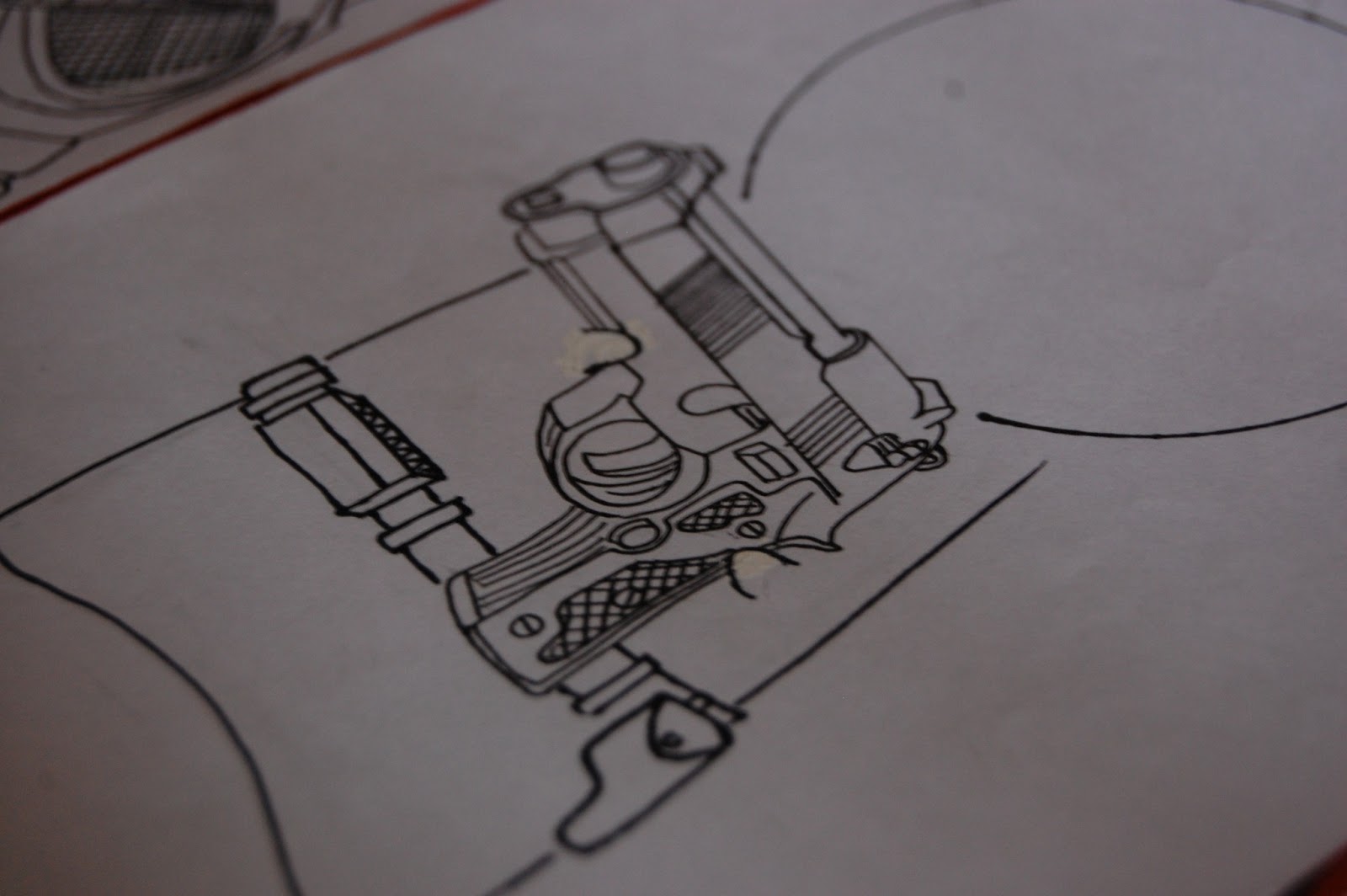
Gun
Cello
Gu'zheng
Dancing shoes
Dancer
Table tennis
Sitting in a field of flowers
Computer
Calligraphy brush with hoody and nerdy specs
Headphones
Netball
Teddy bear
Cupcake
iPhone
Squash racket
Polaroid
Theatre mask
iPod
Backpack (as in backpackers' backpack)
Hurdles (track)
Camera with Fairy Tail logo
Dream catcher
Euphonium
A collage(teddy bear, camera, puppy, guitar, balloon, clover)
Holding a star
Da'gu (a type of Chinese drum)
Headset
Desserts!
Beaker (I made Mr Mac's design first, so to maintain some similarity between the designs of our two lovely form teachers, I had Mdm Hia floating in a beaker since she is a Chem teacher...)
Coffee cup (this was inspired from the coffee cups Mr Mac brings to class almost everyday, he had a small black cup that had a checklist of things to add in coffee, such as sugar, milk, cream...so I did a cup with a tick in front of <3 308, which means he love 308 more than coffee><)
Pheww...this is a super loooong post, but I had so much to say about this experience!
love 308'12:D
.jpeg)