Showing posts with label 2-D Fine Art. Show all posts

Wednesday, 25 September 2013

Chinese Ink Painting


So. After going to the art class to do pencil sketches for months, my teacher (陈老师) finally convinced me to pick up the calligraphy brush again and learn Chinese ink painting with him. (I was in calligraphy club for 3 years in primary school...we did mostly calligraphy though, and I've only painted bamboos before.) It felt really weird working with Chinese ink again--I almost forgot how difficult it was to control the brush and the ink at first, especially controlling the amount of water to mix the ink and paint with..my first few attempts were either too dry or too wet:(
So here are the few attempts and 'paintings' (they are more of practices than actual paintings) I've done in the class in chronological order..words are written by my teacher..my calligraphy has failed me too many times:


Bamboo
Chinese Ink Painting
2011
As you can see, I had used too much water at first, so the bamboos at the back were really smudgy. But after going back to practicing the leaves and branches for a long time, I decided to rescue this piece. It certainly look much better now, though the stems are still too thin.
Orchid 1
Chinese Ink Painting
2011
This was the result of painting before I've practiced well. The forms are awkward and there was too much water. Heck, it doesn't even look like an orchid..well, at least I've learnt not to rush the learning process of Chinese painting.
Orchid 2
Chinese Ink Painting
2011
Orchid 3
Chinese Ink Painting
2011
I personally loved this one the best...it's the evidence of my hard work:) Since I really liked painting orchids (especially the leaves), I had practiced this one really really hard. And I think it had certainly paid off! I am most proud of the flowers, since it was pretty challenging to get the colours and shapes right- it needed a certain amount of lightness. The darker leaves were added by my teacher, since it was just a practice, he was just correcting me, but I'm still quite disappointed that it's not entirely my work...No matter what, at least I've learnt something from it--contrast! 
(I've done another one after this in colour, but I've given it to my teacher, I think.)

Fishes 1 (三余)
Chinese Ink Painting
2011
This reminded me of the '留白' principle from the SoVA assignment! Anyway, I've learnt that in Chinese painting, most of the fishes should swim 'upwards', as a symbol of good fortune or luck, if my memory did not fail me.

Fishes 2
Chinese Ink Painting
2011
Again, just saying that the fish on the left was by my teacher..this really shows how much I have to improve on. I admired the way he painted with such ease, and how the fish looks so lively and like it's really swimming. Not like mine, which kind of look like fishes, but they still look too 'painted-on', and not alive.
Cherry Blossom
Chinese Ink Painting
2011
This was the last painting I've done before stopping class. 

I loved painting the flowers, but the branches was really hard to get right...but I think after so many practices..it looked ok:) Though I would still want to practice more in the future to get a more bark-like texture, which might be able to achieve with a drier brush.
As for this, I learnt about the composition for these type of subject matters. Since as for the previous few, I had been pretty much following my teacher's examples, he would usually show me how each of the parts are done and how I should compose my painting. But as for this one, his composition..was too complicated, and also due to time constraint that day, I came up with my own! And I think that it had turned out quite alright:)

Of course, these are definitely not good enough, since I was still having some trouble controlling the ink and the brush, but I think that I did improve a lot since the first day I started Chinese painting in that class, in both the ways I handled this medium, and the confidence I gained holding a brush after so many practices. And since I am on the topic of practice, one thing I've learnt was definitely the importance of practicing. Because each time I make a mistake in painting something, I would learn something new, be it the composition, the colour or the way I applied the paint:). Also, I think that the sense of accomplishment I felt after finally painting something that looked fine was really worth the effort put in during the practices. 
So, if I have the chance, I will practice more in the future, and continue to improve!:D Oh and practice calligraphy too!--I want to be able to at least write my name myself without destroying the whole painting..

Conte Crayon: Chinatown

Conte Crayon
A3
Chinatown, Singapore
2011
This piece was done as an assignment in Sec 2 when we were just being introduced to conte crayons. We were brought to Chinatown to take photos, and from those photos, choose one to replicate in this medium. I chose mine mainly because of the subject matters and the contrast in the photo, since this work was to be done in black and white, I felt that having a contrast was especially important.

I felt that I had done a okay job:) It felt more impressive then, perhaps due to it being a new medium to me, and the size of this work. But as I look at it now...I think that there are still quite a few areas I could have done better in. Such as the blending of colours (the way I blended some of the grey areas made the work seems kind of..dirty..), and also the details of some places (The letter boxes were not done very well, as there were a lot of reflections, but it can definitely be worked on).

Generally, I felt that this medium was quite fun to use, it really made me take note of the contrast of subject matters. I do want to use this medium again in the future:)

Drawing and Painting Assignments

These are one of the drawing and painting assignments we had back in Sec 2. We were suppose to visit a market in June and take photos, then from there, we were to choose 2 to draw with pencil. The painting was just to paint a still life, which must be food, with acrylic paint. 

Pencil
A3
2011
Pencil
A3
2011
Reference photos
To be honest, looking back now, I think that I did not really do a good job for these two. Perhaps it's just that I didn't use to draw very well back then, but the quality of drawing is pretty bad. There were definitely points that I should have done much better, such as adding in much more contrast, I think that I might have been afraid of making mistakes if I had shaded in too much shadows, but this made the whole drawing look very pale and lack highlights. Also, I really should not have blended the shadings, as without a proper blending stump, the whole drawing looked kind of dirty (especially for the second one). Though I am glad that the proportions were generally alright:) And at least I think I had improved in these areas a lot more in the past 2 years:) Improvement = good!:D
Strawberries
Acrylic paint on paper
A3
2011
I think this was the first acrylic painting on paper I've done..I remember getting quite annoyed when I was painting, as I was pretty bad with mixing colours back then (as you can probably see;), but overall, I am quite happy with it, especially because I painted without a photo reference:)

Monday, 23 September 2013

Artist: Agnes Cecile

Silvia Pelissero, who is best known as Agnes Cecile, is an Italian self-taught artist famous for her expressive watercolour and enamel paintings. She had always been one of my favourite artists because I love and admire the way she handles watercolour. She is able to control the paint, yet giving it freedom on the paper to express herself, such that each splatter of the paint in done with intention, the direction and area of the wash is in her control. But when we look at her works, there's a sense of freedom and expressiveness from those splatters and washes.

For her watercolour works, she would normally just do a simple light outline, and then paint everything in watercolour. As the process progresses, colours would flow, paint would drip and dots of colours would be splattered in some places. And this is where the magic takes place. It is amazing to watch her paint, seeing how a watercolour portrait that is already so fantastic by itself, transform into an emotional and expressive piece that I just want to look at all day long.

Agnes Cecile with her works
She's pretty too! haha
Ragazza Falena
Watercolours
This one was in my coursework prep board as an Artist Inspiration!
I love the fact that the colours she chose are beautiful and deliberate to fit in with the mood too. The faces she paint always mangaged to draw me in, like each of them is trying to tell the viewers their stories with the colours, the splashes, and their expressions.

(Though I do hope she can try faces with a larger variety of expressions)
Miss Universe
Watercolour and Ink

take off in flight / spiccare il volo


the water workshop II
The Water Workshop II
Watercolour and Ink


Also, another reason as to why I love her so much is that she's really really versatile. She's amazing at watercolour, yes, but the way she handles other mediums are just as good! Below are several works she's done in different mediums:
Anyway Just Tell Me Who I Am
Acrylic, Watercolour, Charcoal, Ink

Breathing-On Blackboard
Watercolour and chalk 


our lines, our story, it isn’t a linear path
Our Lines, Our Story, It Isn't a Linear Path
Varnish
My Eyes Refuse to Accept Passive Tears
Oil

Clint Eastwood
Pencil
Embrace
Digital

About a New Place
Acrylic on Wall
After following her for a while, I am now much in love with watercolours and really wish to be better at handling that medium (I don't think I did too badly for my coursework...considering it's the first time I used watercolour:) So after the exams, I am going to work on my watercolour skills definitely! I don't think I'll ever be as good as her, but I'll try my best with this medium!:)

Nanyang
Watercolour on Paper
2013
(One of the drafts I've done for my coursework- I didn't exactly follow her style though)

If you are interested to find out more about Agnes Cecile (I know you are), below are links to her website and deviant art account, go and take a look~immerse yourselves in her pro-ness;):

Oh and do check out her Youtube video, where you can watch her paint (they are speed paintings, so don't worry, they are not too long)

Saturday, 21 September 2013

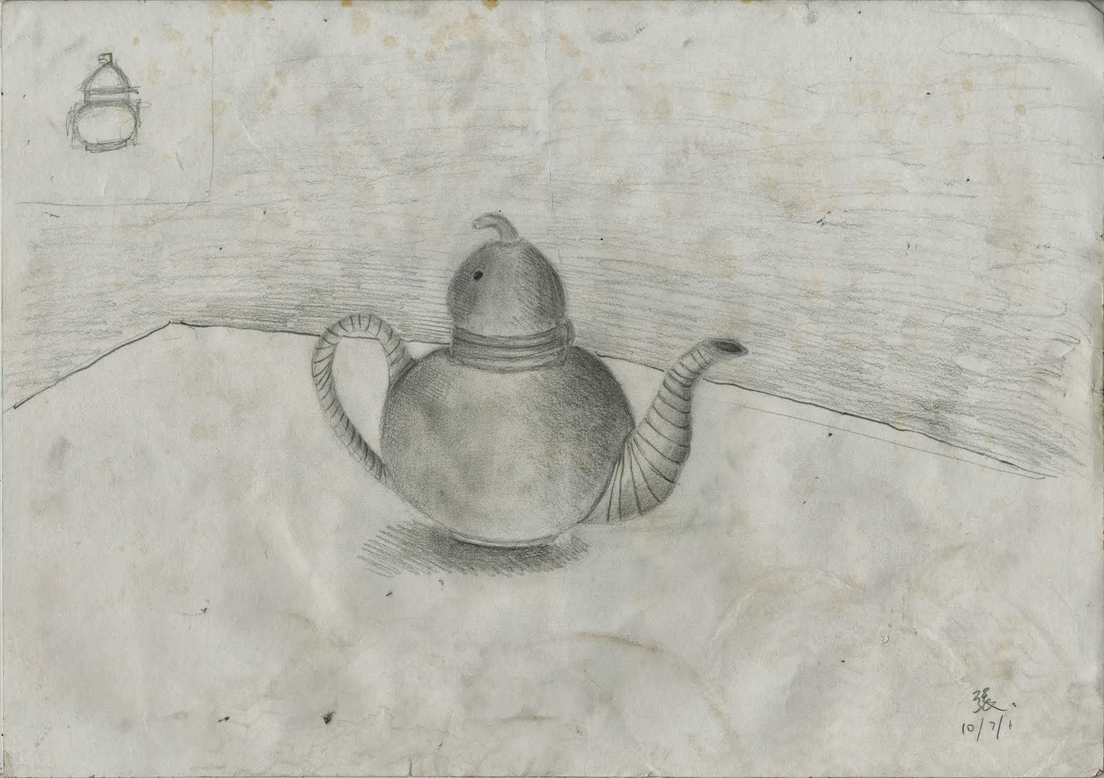
Still Life Drawings

 I had taken art classes since...kindergarten? It was too long ago.. Anyway, after coming to Singapore, I didn't have anymore art classes, and I really really missed them.
So in Sec 2, I begged my mum to let me join an art class to hone up my sketching skills, since I was really disappointed with the June assignment. Coincidentally, one of my mum's friends had started taking up art classes to learn Chinese painting and calligraphy, and she said that the teacher doesn't mind teacher pencil sketching too, so in the 2nd half of 2011, I joined the class under 陈老师 (Mr Tan Khim Ser).

(I didn't expect that I would be the only kid there though...><)
The class was really fun, and it was awesome talking to the adults as they would teach me a lot of things--we would exchange opinions on the works, and give each other tips..though most of the time it was them to me..and some of them were really good!~so inspired)

Here are some of the drawing from that class (my teacher always find random object lying around his house for me to draw..since he doesn't actually teach pencil drawings.)

This was the one my teacher made me do on the first lesson to see where I was, and helped to point put my main mistakes, such as the lack of contrast.


I had thought that drawing glass would.be very hard, but it was alright:)


Last pencil drawing at the class...my teacher had been convincing me to learn Chinese painting since almost when I first started class. So I finally decided that it was time to give in and start painting again!:)

Anyway, given the short period of time, I felt that I have actually improved since the start of the lessons. I was able to draw with more confidence, and one thing I've learnt from 陈老师 was that even when I'm drawing a real object, it should not be a total mindless replication, as that's what a photograph should do. A still life drawing should show both the appearance of the subject matters and be slightly expressive--it should be made alive by the pencils-such as by having lines that have varying thickness and so on. Also, a good pencil drawing should not be blended too smoothly (a good one should not be blended at all if there's no need for it!), because the shadings, the transitions between light and dark, the gradients should be smooth and controlled by itself, there should be no need to blend them.

Wednesday, 6 June 2012

Dragons


I don't know what's with me this few weeks, I had suddenly fallen in love with a certain mythical creature, namely the dragon. Yes, the fire-breathing, gold-hogging creature that loves to gobble up every knight that passes by. But they are also magnificent creatures that shows grace and elegance, and they are also, well of course, mythical, which is also the quality I guessed that attracted me the most. They are always part of legends. From the ancient Greeks to the Romans, from the West to the far East. And they are almost always so different from each other, there are dragons which are portrayed as gods, there are dragons which hogs gold, capture princesses and kills knights, and there are those which are the kindest, sweetest and most intelligent creature around.


The Frisky
Pencil (Mechanical, 3B)
A4 printing paper
6.6.2012
 Here's something I did today, a pencil drawing of a dragon. It is... well I admit, not the best drawing I did, but I'm still quite proud of it, since it's like the first time I ever drew a dragon, not very bad I think, not trying to be humble at all><

This type of drawing...normally shows a lot of lines,using colours to fill up the picture, but still using the lines to sketch, showing the shadows and and shape of the whole thing. Usually it is done with ink, and then just add a thin layer of watercolour wash, not too thick, but just nice so that the lines and the colours correspond each other perfectly.

I had really admired people who does this type of drawings, since I myself was not confident enough for it, it requires confidence and instinct and skill.But this time, since it's the first and I'm not that comfortable working with ink yet, so I just did it with pencil, and it looked better than I had expected.
Anyway, back to dragons, this dragon, credit to DRAW DRAGON and Other Fantasy Beasts, is not the cover of the book. What? Of course I didn't create it myself>< I followed the basic structure of the creature and some of the details, not copying exactly though, and the picture on the cover is ink and colour. It took me about 40 minuets, and I can say that I need a lot of improvements and learning so that I can create my own personal dragon but well, I am happy.

Monday, 14 May 2012

Nanyang, Sing!

This is totally over my expectations, much better than what I thought I could do, I love life!

Today we had to decorate part of the 馨 word for Nanyang's musical this year. The word is divided into two sections, the top and the bottom. Outlines were already drawn and we just have to decorate the word, the teachers said that after we are done, two people's pieces will be pasted together back to back and hang around the canteen on strings, such that the top will be hanged with the bottom below it.

And this is what I did (with markers):


I had originally coloured the word (half of the word, I mean) with colour markers, but I soon realised that I don't have a lot of colours, and the colours look kind of wrong...so yeah.

Anyway, I am still quite proud of it:)

Saturday, 5 May 2012

Not yet half way there


I am still at the beginning of my prep work for the school project, namely,
 'Our Nanyang, My Nanyang'.

It was said to be for the 95th anniversary this year so we had to do a painting portraying NYGH, on a A2 sized canvas which will be stretched by myself (I am really looking forward to this part of course, being a person who's really bad at painting).

So this is a sketch of the Castle Howard in New York, a castle that I was lucky to find that resembles the school building. Since I was going to transform, 'trying to', I should add, Nanyang into a castle. Well... good luck to me. I have no idea why I got such a hard-to-paint thing for myself, but I must say that I am quite proud of this idea, it is certainly much harder than my original idea, but also much better.

I am currently still worrying over which of the few girls/fairies' designs I should choose, all of them being so...cute, and not really good for painting...So as long as I don't have anymore designs coming out, I'll have to stick with one of them, urghh..Go Me!