Showing posts with label Writing. Show all posts

Wednesday, 25 September 2013

Artist: Carne Griffe

Since I've just put up the post on Agnes Cecile, let me introduce to you guys the artist who I've liked and admired even before her  (and still do of course!). The guy who got me interested in the splattering and washing of watercolour, and the magical combination of ink and watercolour---Carne Griffe.

I found him by accident last year, when I was passing time by randomly google-ing  for tea painting or some sort while waiting for my tea-stained paper (it really turned out looking kind of like parchments, so I was happy:) to dry.And then I came across him. Carne Griffe is an artist and illustrator who works primarily with calligraphy ink, graphite and liquids, such as tea brandy, vodka and whisky. His works explore both human and floral forms, figuratively and in abstract sense (He had worked as a gold wire embroidery designer for 12 years, hence the floral patterns, repetition and flow in his works).

Taken from his bio, I couldn't have explained his works better:

"He is fascinated by the flow of line and the ‘invisible lines’ that connect us to the natural world. These may be considered lines of energy or spiritual connections between ourselves and our surroundings and his work is often an emotional response to images and situations encountered in daily life. These daily images are recorded in a dream like sense onto the page where physical boundaries are no longer important. Carne’s work takes us on a journey of escapism, often focusing on scenes of awe and wonderment, they offer a sense of abandonment to the artist and to the viewer an invitation to share and explore this inner realm.
The violence of flowers series explores our relationship with nature further.  It draws an analogy between our darker side and the deception and violence inherent in the plant kingdom that is often masked by their beauty."
Here are a few I liked the best:
Comfort - Ink and tea on paper by Carne Griffiths - Sold
Comfort
Carne Griffe
One of mine favourites!!
Goldleaf
Goldleaf
Carne Griffe

Flight - Ink and Tea on watercolour paper 22 x 30 inch Framed £1400 (Large)
Fragments
Ink and Tea
Carne Griffe

Torn
Torn
Carne Grif


Revive
Revive
Carne Griffe

Sunlight
Sunlight
Carne Griffe

Metamorphosis
Metamophosis
Carne Griffe
Smother
Smothered
Carne Griffe

It is one thing when an artist uses one medium well, but it is another thing when an artist combines multiple mediums (graphite, ink, tea, brandy and so on) all on a piece of paper, have them complementing each other and  supporting each other to make a great piece of work. And this is one of the the main reasons why I love Carne Griffe. In his works, the different mediums seems to be made for each other, each playing a key role in bring out the mood and atmosphere of the works. Also, I really really like how he incorporated floral designs into the works, they fit very well with the mood and everything, and with flowers, there's always a sense of delicacy, which I think helped to make the work more emotional.

Another thing about his works that appeal to me is the details on top of the washes, splatters, drips and slashes of colours. His works do not only look amazing from far, the amount of details and the delicacy of the lines are enough to awe me too.

As I am writing this, I'm  also kind of comparing his with Agnes Cecile's works, as both artists do have some similarities in styles. I felt that though though both artists' works are emotional, Griffe's feels more delicate, more sensitive, there's a softness to even the most emotional feelings in his works(perhaps it's because of the colours). while Cecile's is more vibrant, even when her work is portraying grief, thoughtfulness and so on, there's always that glimmer of hope (It's like saying: 'at least they still have the vibrant colours, no hope is entirely lost yet.')~ I do like most of her colour palattes. Therefore her works are definitely more eye-catching, but sometimes I wish that she'll explore more types of emotions, and not painting 'perfect' faces (they are awesome of course..in a good way:), and more desperation in their eyes, to show the viewers their emotions. As for Griffe's, his works catches the heart better, that's all I can say:) 

Anyway, I still love both artists and I think they rock in their own (still) unique ways, and I am glad that I can be inspired by both of these two awesome people:)


Comments

http://galiauxy.wordpress.com/2013/07/03/55/comment-page-1/#comment-6
http://skatches.wordpress.com/2013/03/22/right-on-target/#comments
http://hotchocolate-peppermintwhippedcream.blogspot.sg/2013/09/dot-painting-with-pens.html

Monday, 23 September 2013

Art Gallery of New South Wales

Art Gallery of NSW had been one of the art galleries I have visited in Australia, and it was certainly one of my favourites there. On the outside, this early Greek-styled building with the names of great painters, sculptors and architects in the history lettered on the walls in bronze had already left me with an excellent impression (I love the early architectures). Upon entering, I fell in love with this art gallery even more, due to both the designs of the building, the use of gallery space, and of course, the art works. 

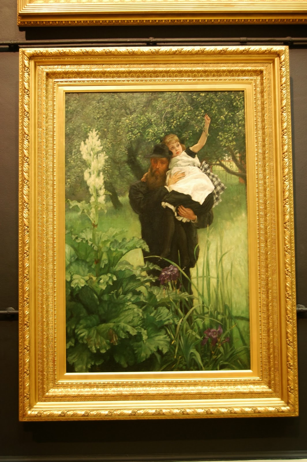
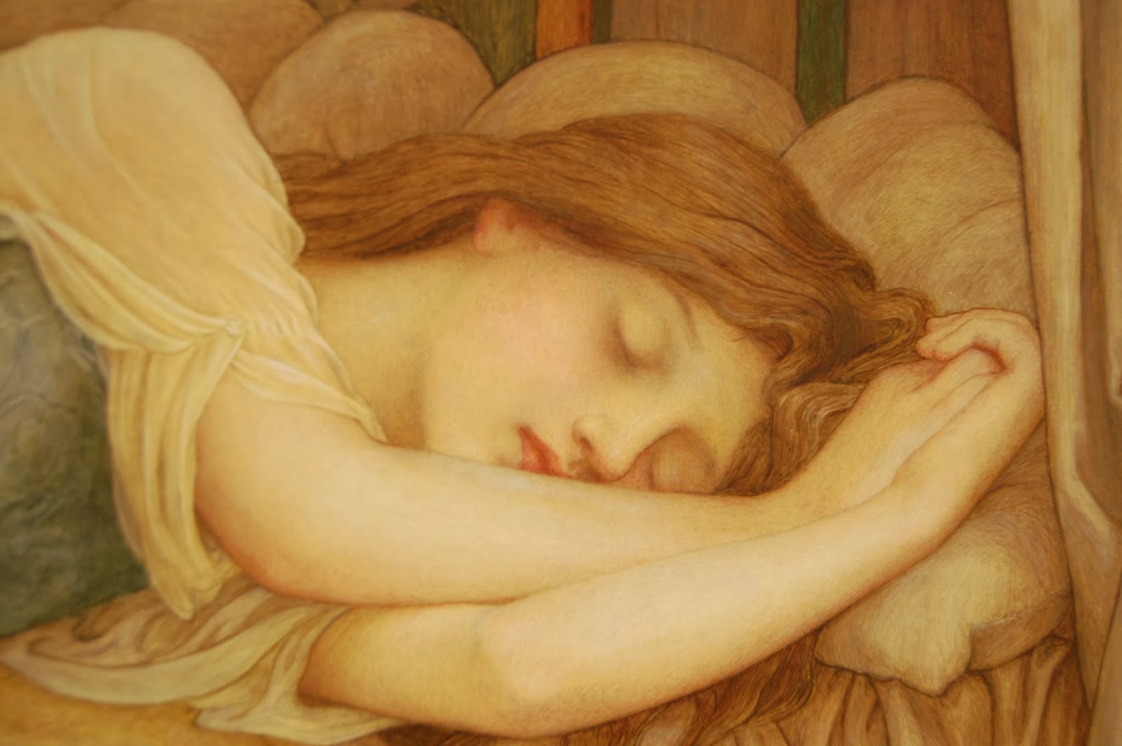
One thing I really liked about this gallery was that it was split into half. There were two main wings in the building, with one showcasing classical, traditional paintings and sculptures of the old masters, while the other one exhibited contemporary modern art pieces, so one can really look at how art has evolved through the ages, and it is a great place to go if you love both types of art!

Art Gallery of New South Wales

The Offering of Peace (1923)

The Lobby

A series of this type of statues were placed along the walls of the lobby
'The Classical Wing'

Don't you just love this??I could literally spend a whole day just wandering in a gallery like this


This piece reminded me of Raft of the Medusa by Gericault-- a much much calmer (and sleepy) version of that though.


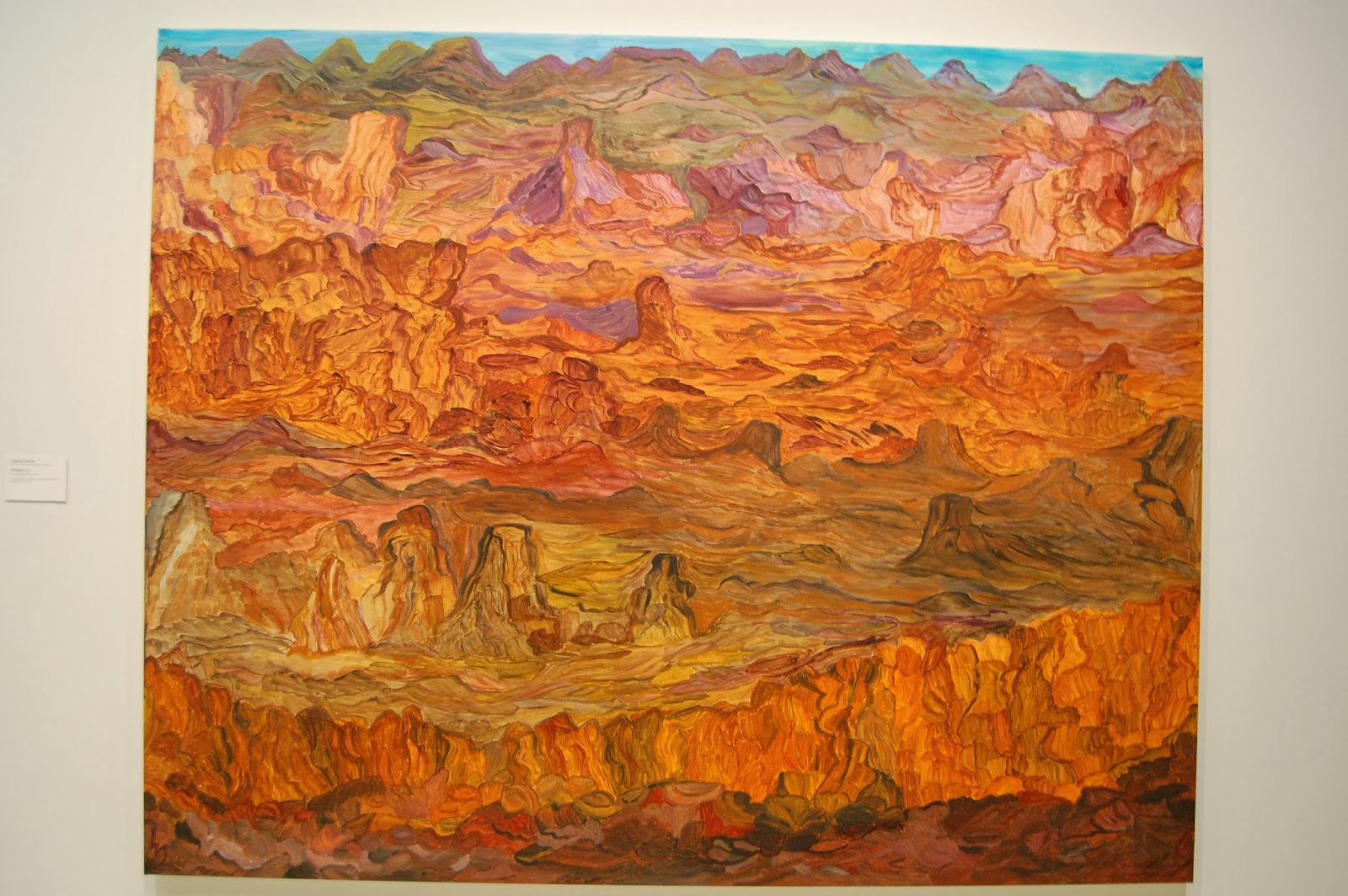
Although the subject matters are definitely rocks, the brushstrokes brought movement into the work.
I love marble sculptures too!
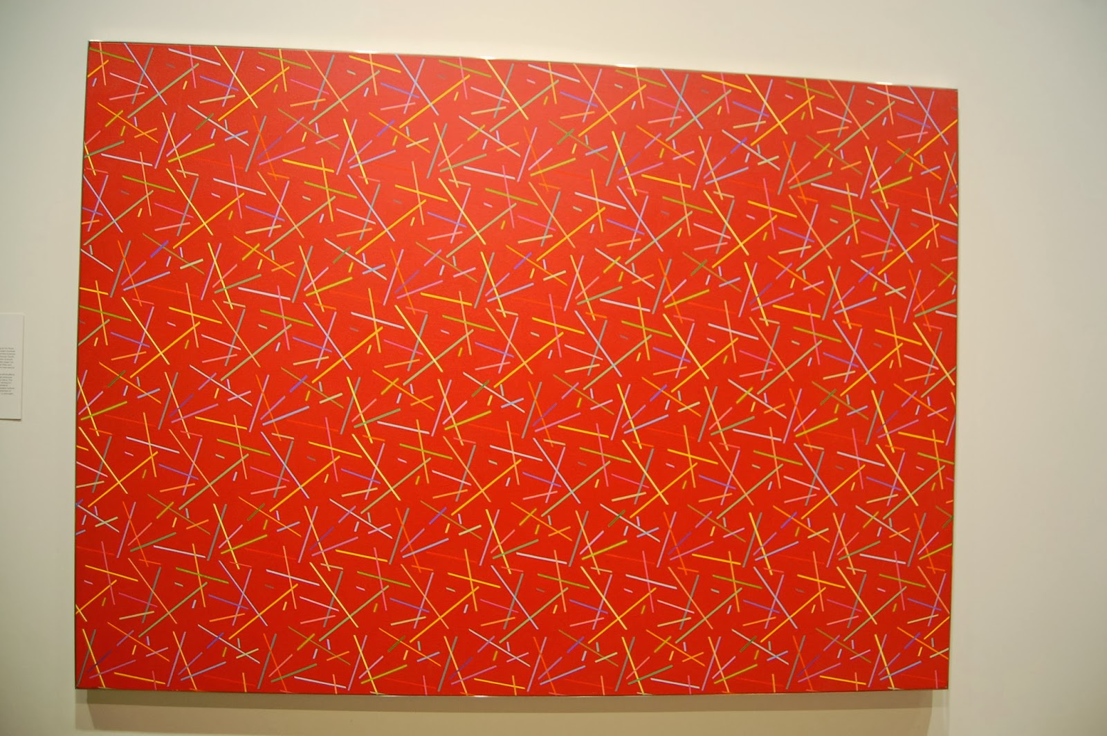
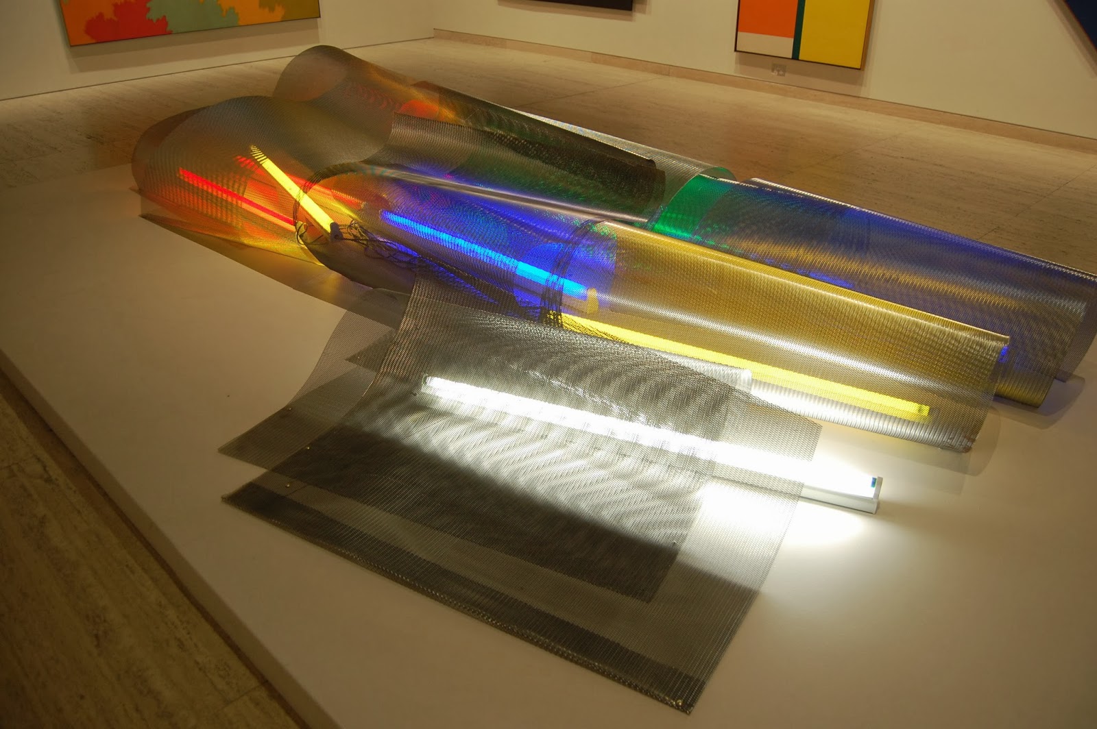
'The Contemporary Wing'
 even the design of this wing is so different from the one above!
    I think this was kind of a native art from some tribes in Australia- I've seen it in several art museums there.
                                                Canvases do not have to be square/rectangle!


This is one of my favourites in the contemporary wing, I love how the artist made use of the colour of the panel for the base colour of this painting, and applying paint only where colours are needed.


Overall, this gallery walk had been a really enriching experience, the classical paintings made me learn to appreciate the old masters' works even more (I love their works!!), and several of the contemporary pieces had inspired me through their uniqueness.

Generally, I think visiting museum/galleries a great pleasure, and I love to walk through galleries with a beautiful exhibition hall (this is important too!) and great works, so I am looking forward to visiting more galleries abroad (through visiting them, I get to learn about the country and its art culture too!) and hope that Singapore will one day have our SAM as impressive as them.

Meanwhile, here's the gallery's website, do take a look if you have time:)
http://www.artgallery.nsw.gov.au

Thursday, 9 August 2012

Reflections


 It is so amazing, as if there is another world behind these flat surfaces, 
maybe if i just reach out my hand, I'd be able to travel into that world, 


 the world that is so similar, yet so different from ours.
Everything will be the same, yet opposite,
Left will be right, and right be be left. 
North will be South, and East will be West


Just like Alice through the Looking Glass